PRE - Interface An AR platform to host real estate marketing assets.
  • Role
  • UX Design, UI Design, Content Creation
  • Software
  • Figma, Adobe Creative Suite, 3Ds Max, Vray
  • Team
  • Taylor Sams, Brandon Hicks
  • Dates
  • 2018 - 2020
  • About Project
  • Clients needed a way to display and interact with 360 imagery and immersive content. MARCH was producing these assets and was dissatisfied with options available to showcase them and so built out a new platform called PRE in house that included architectural and sales information overlays. The 1.0 version was launched but the interface needed to be refined and made more usable and pleasing. I worked with one of the partners to develop the interface and graphic standards to ensure the platform held up to the high quality of the work it was showing.
     
     
  • Project Goals
  • Refine the prototype interface to be more usable.
  • Develop a set of standards for integrated graphics.
  • Design responsive containers for a web of scenarios.

Exploration

There was an existing early interface and ux set up, so I was able to collect and compile feedback from coworkers and clients who had been using the existing version to find out what they found successful, frustrating and if they had any ideas about new things they would like to see.


Intitial Brainstorming and Information Gathering
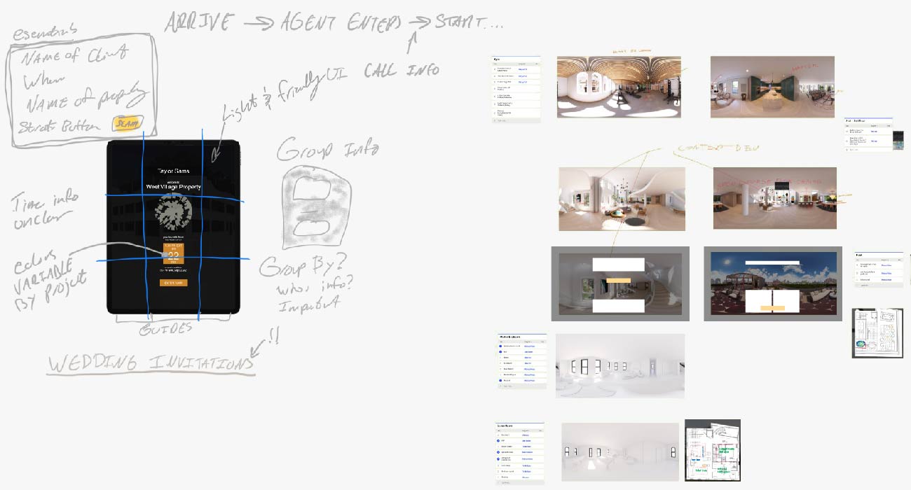
Background on 360 Content
 

Early Development

As I ideated around the foundational goals of the project I put together, personas, user journeys, and empathy maps to build out my understanding of where and how the design needed to function and how to meet users where they were. I developed low-fidelity prototypes to test parts of the user flow before bringing it all together into the final set of designs.


Platform Access

While originally the scope of the project was only for a web based interface to allow clients to properly view and use 360 content it soon became apparent that users really wanted much more functionality to host all sorts of other supporting content. As these supporting assets were added I worked to: develop a consistent set of actions to bring this information to the front and remove it again; design button shapes and locations so that they would be easily accessible both on desktop and mobile devices; and a series of deployable graphic standards for this additional information to adhere to so that it would remain legible overlaid across a variety of content.


Ideation and User Flows

I used meetings with content creators who used the platform and the partner developing it to brainstorm and sketch out how the platform could be improved and what needs they had. I developed a list of “musts” of the information on each screen based on their feedback and then took that though a series of sketching exercises to see how it could best be organized.


Design Update

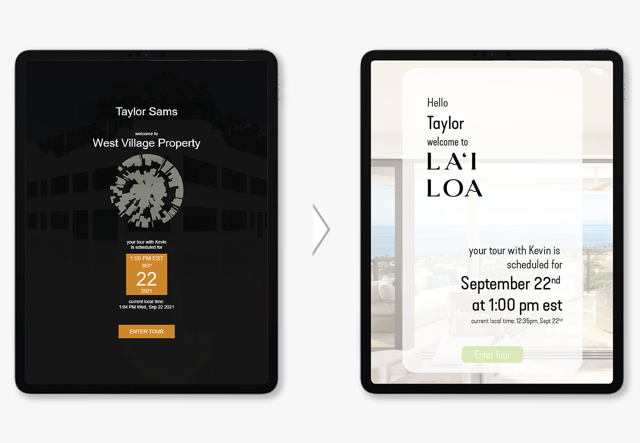
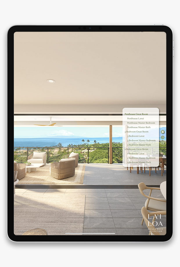
Main revisions to the platform happened to two pages: the welcome page for guided tours and the interface for the 360 content.


Login Screen Experience

The log in screens represented the information that was already there and refined it to make it more easily understandable and enjoyable. I took inspiration from wedding invitations to give this part of the user experience a highly personalized and luxurious feeling.


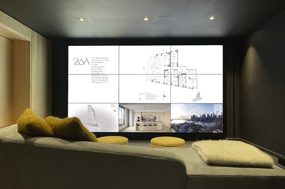
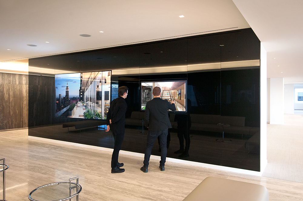
Large Scale Deployment

In large format presentation settings the onscreen controls are removed and placed on an iPad mini which acts as a controller for the display, the control interface on the tablet iis still being refined.


Interactive Information Overlays

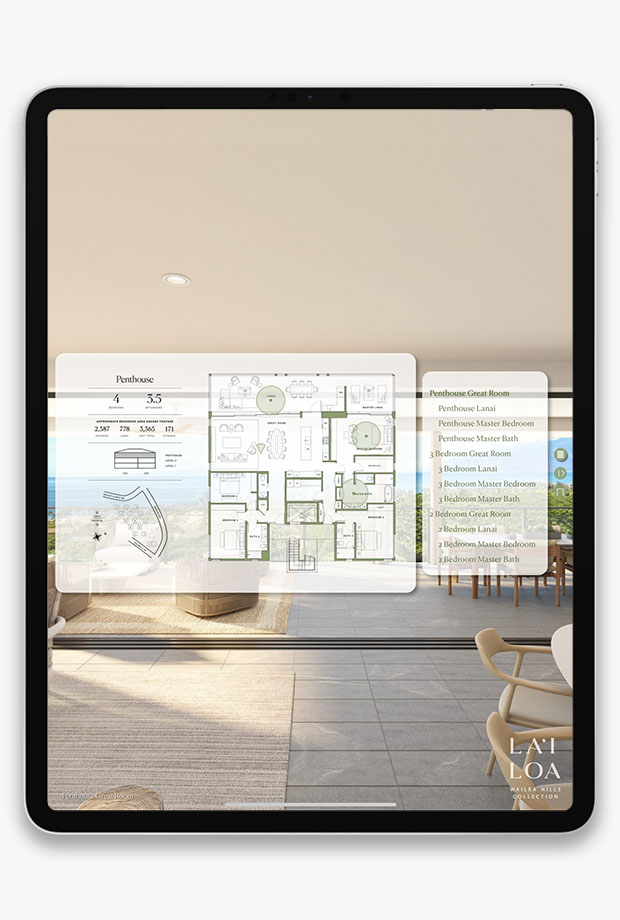
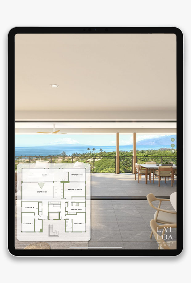
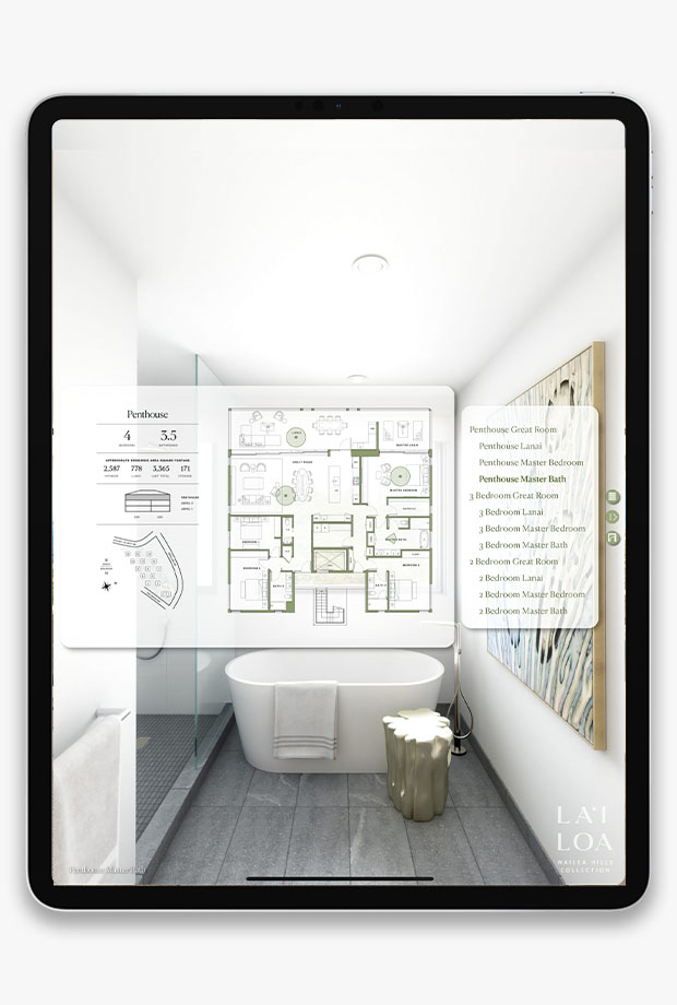
The interactive pages needed a way to elegantly overlay dense information on immersive imagery. I refined the graphic standards for the interface and added new interactions and animations so that information slid out from off screen in a consistent and expected way as well as simplifying the button interface to make it more accessible and familiar.

Selected Screens
 
 
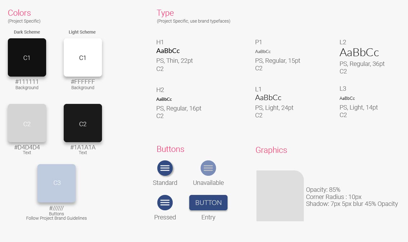
Style Guide
  • Graphic Specifications
  • The platform should adapt the brand guidelines for each project that it deploys for. This means that colors should be integrated into the button, menu, and graphic colors as well as project specific fonts if they exist. Plan Graphics should be backed in a 60% opaque either white or dark grey shade to define their outline and line work should be tested for clarity no line should exceed 1pt in weight…
     
     
  • Integration Specifications
  • Plans in .png at 1200px max dimension with no padding
  • Buttons to match project colors
  • Typeface to match project branding

Next Steps

While version 2.0 is a big improvement over the first iteration users are asking for additional features like video chat integration, a GUI for the CMS and live rendered unit displays. Before tackling these new features I would like to interview users about how the current version is working for them and where there could be improvements we haven’t considered yet.
 

Thanks for exploring my project!